The team at Wehl approached Mark in 2015 with an incredible vision for a new kind of online community and social platform for health and wellness. "Wehlness", as it were.
Mark was tasked with designing the brand for a community free from the toxic business models and destructive habits the other platforms are unfortunately known for. This necessitated a clean aesthetic, calmining minimalism, vibrant colours, and soft rounded corners.
Concurrently, Mark began coding the backend with features for a unique wellness journey in community.
In 2016 wehl.com launched, bringing this vision to reality. New features are introduced to the platform on an ongoing basis, along with routine fixes and usability improvements.
Logo Development
The two halves of the "W" in the Wehl logo are reminiscent of two friends facing each other and holding hands, helping each other along in their wellness journey.

Identity

Icon Development


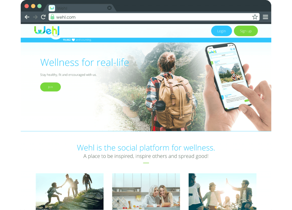
Website Design + Development

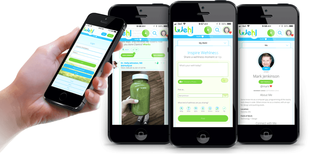
Platform Development
